Monday, July 16, 2018
What Are the National CAD Standards, and What Do They Mean to Me?
Periodically, we have clients come to us asking for advice on working with the National CAD Standards (or NCS) because a client requires their drawings to be NCS compliant.
The important thing when working with clients who require compliance, is identifying what parts of the standard they want compliance with. Many organizations think of the layers standards and forget about the rest of the NCS, so may only be looking for compliance with the layer naming portion of the standards. In certain areas, there are options rather than a specific direction, so again, knowing what the client needs specifically is important. The version of the standards is important as portions of the standards have changed and included different options each version. In some cases, the standards aren’t detailed enough for design and need to be extended to support that. The standard has allowances for that. A single requirement statement requiring NCS compliance isn’t really enough due to some of those choices.
What Are the Standards?
The NCS is built from several different standards. The layering guidelines come from the American Institute of Architects. Drawing layout and construction comes from the Construction Specification Institute (their Uniform Drawing System) and plotting guidelines come from the National Institute of Building Sciences. The NCS coordinates these different guidelines into a single package. The National Institute of Building Sciences makes the standards available online through various license packages. The web address is https://www.nationalcadstandard.org/ncs6/index.php.
The NCS consists of several modules that detail various parts of the drawing process. The Modules are:
1. Drawing Set organization – Sheet order, identification, etc.
2. Sheet Organization – Sheet format, title blocks, sizes, etc.
3. Schedules – Guidelines for door, window and other schedules.
4. Drafting Conventions – Process notes for projects.
5. Terms and Abbreviations – Standard terms.
6. Symbols – Standard blocks organized by MasterFormattm divisions.
7. Notations – Guidelines for adding and linking notes.
8. Code Conventions – Regulatory annotations.
The layer standards have their own set of documents, including a Microsoft Excel file with the layering guidelines and a PDF describing how the standards work. The standards basically consist of a discipline indicator, a major and minor group (or two) and followed by a status or phase.
In addition, there are plotting guidelines, Excel sheets for samples and a set of blocks to match the standards.
The Standards and Autodesk
The industry specific versions of AutoCAD (Civil 3D, Architecture, MEP, etc) include templates with NCS layers (technically AIA layers) implemented. For example, Civil 3D includes the Autodesk Civil 3D (Imperial) NCS.dwt template which includes an implementation of the layers, complete with a number of layer descriptions filled out.
The challenge is there are no status indicators. For example, existing layers should include a status indicator to segregate new from existing or objects to be demolished. So that could potentially multiply the number of layers substantially. And of course, with Civil 3D, the BIM objects are managed as objects, such as surface, so the sub objects like contours, are dependent on the style definitions. So the surface itself may need to be on C-TOPO-D (to be demolished) or C-TOPOP-N (new work). The organization then decides whether it is necessary to create styles differentiated by status as well.
The need to explode the drawing to AutoCAD and remove the BIM objects would necessitate styles with layers detailed with that differentiation.
In the way the layers guidelines are applied to different projects or organizations, the same types of questions and answers should be generated for the other modules. For example, the sheet identification. The sheet organization describes methods and options for numbering sheets, but only addresses design sheets, and doesn’t address models or data references. Does the project require Level 2 discipline identifiers (ET for Electrical Telecommunications) or just the Level 1 (E for Electrical)?
Ultimately, the requirement to comply with NCS standards should be the start of a conversation and being familiar enough with the standards so you can address these questions can save a lot of time trying to figure them out during the design or save some heartburn during submittal. In the end, the goal is to get the design date integrated in with existing, operational data, and the standards are the key to migrating data from multiple sources.
BIM to GIS: Getting Your Pipe Network into a Shape File
One of the hot topics, particularly for me, this year at Autodesk University, was the announcement of the partnership between Autodesk and ESRI, the makers of ArcMap, the prominent GIS software around the world. The goal is to add more interoperability between BIM and GIS. To get started today, I’m going to address at least one piece of that puzzle. In the infrastructure environment, more often than not that’s going to include pipe networks. With Civil 3D we already have the model-design workflow identified. We model pip networks in Civil 3D, push them to SSA, run the models and adjust the design, and then push them back to Civil 3D. But after the design, it’s important to get those pipe networks into our GIS for long term operational management.
Some people are aware of the Export Civil Object to SDF on the Output ribbon, but I don’t run across too many people who are familiar with the format. SDF is a Spatial Data File, and is a GIS format, but it is pretty much exclusive to Autodesk. It’s comparable to an ESRI personal geodatabase. It’s designed for a single user, and can carry multiple feature classes. The fact that it’s pretty much an Autodesk format stops most folks as other GIS systems don’t support it. It needs to be transformed to a more universal format.
So we’re going to convert it to a shape file, which is pretty much the de facto universal transfer format. The first step we do is get our pipe networks ready, and then go to the Output ribbon to select the Export Civil Objects to SDF command.
Then it opens the Export to SDF Dialog. It prompts for the new filename and location, and the projection you want to use for the data. Once you select OK, the export is completed. It doesn’t prompt you for which civil objects, as it will export all of them. Since the SDF file manages multiple feature types, they all go into the same file.
At this point I find it useful to connect to the data to review the results, and we’ll need the connection to get it to a shape file.
You’ll need to open the Map Task Pane either by changing to the Planning and Analysis Workspace, or turning on the Map Task Pane on the Home Tab.
Once the Task Pane is up select the Data icon at the upper left and select Connect to Data.
Be sure to select the Add SDF Connection, and then add a Connection Name, and then locate the SDF file you just created.
The different data sets come through from the possible civil object groups. All of the data sets will show even if you have no data in them. In our case we are going to select the pipes and structures and Add them to the Map. The data in the SDF file should now overlay the objects in your drawing. I find it’s a great wat to verify all of the data came through.
Now we’ll want to go back to the Data Connections and this time use the Add SHP Connection and use the folder option and select the folder where you want to create the new shapefiles. Connect, but don’t add anything to the map.
Next we go back to the Data button on the Map Task Pane, and then select Bulk Copy.
The Bulk Copy dialog box is a bit confusing at first look, but is intuitive once you understand it.
The Source side is the original data set, and in this case, the SDF data with either the pipes or structures as layers.
The right side will be the new shape file. Select the checkbox for Structures (or Pipes) and all the lower boxes should get selected. These are the different attributes in the feature class.
In the target box, select the new shape folder connection name. Select the check box in the area below, and the names from the left box (the original SDF) will be copied over to the right side (the new shape file). I typically rename the Schema to Structures or Pipes to keep things clear – select the field and it should allow text editing. The other requirement is to change the Autogenerated_SDF_ID by selecting and retyping it to ID - The shapefile only allows field names up to 8 characters.
Select the Copy Now, and the new shape file gets created. Add it to the Task pane to compare and validate the copy. Use the same process to finish the other part of the networks (pipes or networks) and you now have a shapefile that can be incorporated to your enterprise GIS.
An Oldy But Goody - MAPCLEAN
A few days ago I was working with someone to prepare some CAD drawings for GIS Conversion, and we had to do some mass changes on the AutoCAD linework. They were unaware of some core commands they had in Civil 3D to make those tasks easier. Thinking about it, I recognize that a large percentage of users probably have no idea some of these tools exist, but they go back to the very beginnings of AutoCAD Map 3D – actually, to the ADE addon package that eventually became Map 3D. These are the Map Clean Up tools (or as they are labelled now, Drawing Clean Up). These tools are very powerful, and to my mind justify upgrading to Map 3D from AutoCAD by themselves. They are primarily designed to clean up CAD data to build geospatial data sets, but can be used to modify AutoCAD objects for any reason.
The Drawing Clean Up tools are found on the Planning and Analysis Workspace on the Tools ribbon. Look for the Map Edit panel, and the large icon is the Drawing Cleanup tools.
For those who don’t want to change workspaces, you can also get to the command by typing MAPCLEAN at the command line. When you start the command, it opens up a “Select Objects” dialog box. That box allows you to select drawing objects you want to modify. You can select all or pick and even select specific layers to pull from. On the layer selection, you can use wild cards, and select for example, c-road* to select any layer name that begins with c-road (c-roads-cntr, c-road-edge, etc).
The bottom half allows you to select items that can be used as reference points that aren’t altered or moved, such as monument points you want to maintain during the cleanup process.
After finishing the object selection and hitting next, you get to the Cleanup Actions dialog. This is the meat and potatoes of the tool set.
You can select one or more of the cleanup actions you want to use.
Delete Duplicates – Exactly what it says – it removes duplicate objects. It will also remove objects that are close to duplicate depending on the parameters – essentially you can specify a tolerance.
Erase Short Objects – Deletes any linear objects shorter than the tolerance.
Break Crossing Objects – breaks lines whenever they cross (see below):
Notice the crossing lines circled on the left, and after the command, grips showing the ends of the lines on the right image.
Extend Undershoots – When a line is just short (based on the tolerance parameter) of reaching the end another object, the tool will extend the line to that point.
Apparent Intersection – When lines look like they should intersect but are too short, this will extend them to the intersection. The parameter is the radius distance between the two.
Snap Clustered Nodes – When there are multiple end points close to each other but not quite touching 9based on the tolerance parameter), the tool will move them to snap together. This is an example where anchors can help – the ends of a road centerline, for example, can be snapped to an anchoring monument.
Dissolve Pseudo Nodes – Removes nodes (points – or points in a polyline) within a line – such as polyline vertices that are in a straight line.
Erase Dangling Objects – Deletes lines that have an endpoint not shared by another line. Tyically used to remove lines that are not part of polygons in a data set.
Simplify Objects – Removes nodes that are within the tolerance on 2D lines. It is also called generalizing.
Zero Length Objects – Removes objects that have no length, such as a line with the same start and end point. This is often why Zooming to extents can cause your drawing to open a huge area where there’s no apparent linework.
Weed Polylines – Simplify objects for 3D polylines.
One of the best parts of this tool set is the ability to make these changes en masse in the drawing. Thousands of updates can take place at once. At the bottom of this dialog, you can apply the edits automatically, or by manually reviewing and approving each change.
You can mix and match the edits to save time, but keep in mind some of these actions actually oppose each other, so combining them can defeat the purpose or do nothing at all. I remember when it first came out thinking it would help to do all the actions at once. Instead it just made a mess of the drawing.
The next dialog – “Cleanup Methods” gives you the option to determine whether you want to change the original linework or create new cleaned up objects (and the layer to store them), and how the objects will be modified.
The last dialog box of the command will only show if you choose interactive edits. Then it shows how to label the various types of edits with colors and symbols. This is very handy when you a looking at the street network of a large town, for example.
These tools have been a real lifesaver for me at times, and I hope you find them useful. One of the best ways to get familiar with it is to create a drawing with various lines, symbols, crossings, etc and trying the tools one at a time. Then when something comes up in production, you know the tool is there and how to use it.
I also put this in a video on the Autodesk Knowledge Network.
Getting a Better RFP for Geospatial Projects
So I posted a screencast to the Autodesk Knowledge Netowrk on getting a better RFP for geospatial projects. I actually posted it just over a year ago, but I thought it would be good to refresh it as so many RFP/RFQ/RFIs we get are still written in a way that it's difficult to actually get a good contract with a high potential for success. The goal is getting multiple, high quality bids and get the services you need.
If you are looking to get a geospatial project, here's some ideas to get better responses.
Insert Satellite Imagery in Map 3D and Civil 3D
Imagery of all sorts has become so important to design and geospatial projects that it’s almost ubiquitous. And most people are familiar with the Bing Map tools built into Civil 3D and Map 3D now. But we often have requirements for imagery that’s more dynamic or serves a different purpose, such as multi-band satellite imagery. So let’s look at how we can bring in this imagery into Civil 3D to use for our design or analysis.
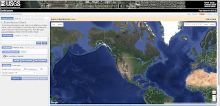
First we need to find our imagery. I’m going to hit the USGS Earth Explorer to download some High Resolution Orthoimagery. I won’t show how at this point – there’s a number of tutorials on the site. But you select the area and type of data you want, and it will generate a download package and link.

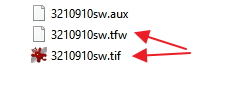
The download package provides a ZIP archive with several stacked directories – depending on the specific data set. Navigate the directories to find the actual image files.
Specifically here, we’re looking for the TIF, which is the image, and the TFW, which is the world or correlation file. The world file tells AutoCAD where the image is in the world. We need both to effectively place the image in its correct geographic location.

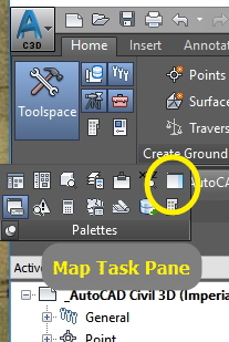
Now we’ll go into Civil 3D or Map 3D and load the image. We’ll need to have the Map Task Pane open. If it’s not we can open it by going to the Civil 3D Palettes ribbon and expanding it.
Once it’s open, go to the Data icon at the top right. Select Connect to data.
Select the Add Raster Image and we’ll go find the image we just saved in the Source File or folder box – note you can use the folder to load several images at once. Be sure to select the image itself – the TIF. AutoCAD will recognize the world file automatically. We can add a name for the connection, and then hit connect. It will bring up a status box, and once it finishes creating a connection you can select the image and add it to you Map.Note that it will read the project, and if your drawing has no coordinate system it will assign the one from the image. If there is one, it will generally re-project to fit the coordinate system where possible. At this point, you also have the option to combine multiple images (if you have them) into the screen.
Depending on the size, it may take a little while, but the image should come into your screen at the correct coordinate system and scale.
This method keeps your performance pretty good as it samples based on your current view scale. You can see the link to your image connection in the Map Task Pane and use the check mark to make it visible or invisible.
Good luck with your imagery!
Friday, May 12, 2017
Getting a Better Geospatial RFP
The Request for Proposal is a lot like a first date. It
becomes the first impression for a relationship we hope will be valuable for
both parties. Like any relationship, communication is the key to success. That
is probably more evident in the RFP than anywhere else in the project. It is
here we are defining exactly what we’re looking for in the potential
partnership. The RFP (or RFQ or Request for Quote) can be challenging and it’s
even more so with highly specialized industries, such as geospatial information
systems – the focus of our discussion today. A good RFP will invite
participation and competitive bids, and a poorly written RFP could get bids
that completely miss the mark or get no responses at all. Even worse, a poorly
written RFP could result in an award that creates an adversarial relationship
with both parties contending against each other.
The most important thing before writing an RFP is to know
exactly what you need and are looking for. That sounds self-evident, but it’s
surprising how many RFPs I run across from organizations who understand they
need something but don’t know what it is they need. Then the RFP is just as
confused. An organization that is new to a technology or lacks personnel with
reasonable knowledge will be much more successful by teaming up with someone
who can assess their needs and clearly define their requirements. In my experience, it’s very difficult to
effectively purchase services when you don’t know what you’re looking for. This
is often much more of an issue with geospatial projects as there is still a
considerable knowledge gap – both in organizations needing the services and
some who would provide services. With the knowledge gap, there is a
considerable amount of ambiguous language in our industry.
The first step is to do your homework – understand the
market and the industry. Find out what’s available in the industry and know
what’s possible. If necessary, trim the requirements or plan on breaking a
project into segments. It’s much easier to find a horse than a unicorn.
Completing an assessment project before embarking on implementing a solution
can make the final solution much more effective.
At this point, it’s critical to identify what your needs
really are. Distinguish between needs and wants. Often there are nice-to-have
elements that can kill a projects budget and schedule, so peel off those
unnecessary layers. The nice-to-haves should be included, but in a different
section of the RFP and clearly identified as wishes.
Next we’re going to discuss several things that are critical
in a well-written RFP. Having these specific headings or sections is not so
important as actually having the information there, and of course, it needs to
be presented in a logical and easy-to-read fashion.
Background – Providing details about the organization and its
needs gives the RFP context. It provides the why and answers many questions the
bidder might have. A comprehensive overview of your organization helps
potential bidders understand why you want the work and can deliver results that
meet your needs. Along with the organizational overview, identifying the
problems you are trying to solve is also important and anything you may have
already done to mitigate the issue. Remember, this is where you start to establish
the relationship.
Purpose – A clear and concise purpose is the meat of the
request. The expectations, requirements, platform and software requirements,
and any other specifics that affect the delivery should be clearly spelled out.
This is the place to identify that you require a specific version of software.
It’s also important to identify the type of relationship
desired. Are you looking for someone to come and do a job once, or is this the
beginning of a long series of projects? That can make a significant difference
on bidding, particularly if there’s some retooling – through software or
personnel.
This portion of the RFP requires the highest technical
capability. It’s critical to understand what you want and to clearly define it
for the bidders. If the project requires a field crew (or crews) to manually
inspect an approximate 400,000 water meters, then it should be clear. If you
have a database definition document, you should probably include it or make a
copy available online. It’s also important to determine the delivery format and
how you plan to incorporate data into your enterprise system.
A schedule is also important to include, even if it’s
preliminary. It helps the bidder understand the resources needed. It also helps
bidders recognize that maybe they shouldn’t bid. If the project is time
dependent with a lot of labor, a small firm without the necessary resources may
not bid. That saves them time from putting together a proposal as well as saves
your time reviewing a proposal with no possibility of accomplishing the
project.
A controversial element to include is the project budget. It
helps define the boundaries of the project. Yet, often people believe that
sharing the project budget will encourage bidders to raise their rates, but the
competitive nature of the bid keeps firms offering their best prices or lose to
competitors with lower rates. Not providing this information can keep qualified
firms from bidding so as not to spend non-billable time for projects of unknown
value. A stated budget let’s bidders know a project is real and can also give
them a chance to identify the appropriate solution. A great solution that costs
10 times the budget is of no use to anyone.
Goals – It’s very important to clearly identify why you are
doing this project. This provides a finish line for the bidder. It gives the
bidder a chance to respond with how he’ll meet those goals. It allows the
bidder to determine a pricing structure that makes sense for the project. And
the upside is that it gives the bidder a chance to exceed your expectations.
Proposal Format – Include a desired list of information you
want to see and the format you want to see it in. That helps the bidder ensure
they provide all the information you are looking for, and it makes it much
easier for you to evaluate multiple proposals.
Evaluation Criteria – Most organizations who issue RFPs have
some criteria they are using to decide the winner of the RFP. This shouldn’t be
a secret. It actually encourages a fairer bid as everyone participating has a
way to identify what they need. If you’re giving points for a licensed surveyor
and a minimum number GISPs, then letting everyone know ahead of time can ensure
you get the best proposals to review and select. If you have a score sheet, I
would go so far as to include it in the RFP.
Wish List – Identifying the actual requirement is the most
critical, but if there are some targets of opportunity available, make sure the
bidder knows and give him a chance to exceed the project expectations.
As I mentioned in the beginning, a well written RFP is key
to communicating your intent. A poorly written RFP wastes the time of everyone
involved. Putting the right effort in up front makes all the difference. The better
the request for proposal is written, the better your proposals will be, and the
better you are likely to accomplish the project goals.
Labels:
Contracts,
Geospatial,
GIS,
Management,
Proposals
Thursday, March 19, 2015
Maplet - Adding Web Mapping Services to ArcMap
Another Maplet for my blogpost today. This one is about using Web Mapping Services. A Web Mapping Service, or WMS, is a method for sharing imagery across the web. It's a great option for being able to share and make GIS data available for others without having to transfer files. It's pretty easy to use as well. A WMS is purely raster, so imagery is the best use, although I've seen people publish GIS data this way as it forces a specific appearance on the data - the drawback to that is the data is not available to the user to query against.
WMS in an open standard and is managed through the Open Geospatial Consortium. The standards are available here.
Here's the Maplet:
WMS in an open standard and is managed through the Open Geospatial Consortium. The standards are available here.
Here's the Maplet:
Labels:
ArcGIS,
ESRI,
GIS,
Tips and Tricks,
WMS
Tuesday, February 24, 2015
Maplet - Splitting Datasets by Attribute
Today's blog is another Maplet for ArcGIS 10. A coworker was wanting to know how to split a dataset into parts based on an attribute, so here is a short video with a couple of ways. For just a few elements, it can be just as quick to do a definition query for each of the fields and then do a data export. You can do the same just by selecting an attribute, and exporting, but you have to remember to only export the selected features.
I also showed a neat little tool developed by Tim Fox of the USGS that automates the process. This can be a real time saver when there are more than a few attributes you want to use. Here is the link to the USGS tool.
Now, the video.
I also showed a neat little tool developed by Tim Fox of the USGS that automates the process. This can be a real time saver when there are more than a few attributes you want to use. Here is the link to the USGS tool.
Now, the video.
Labels:
ArcGIS,
ESRI,
GIS Introduction,
Mapping,
Tips,
Tips and Tricks
Wednesday, February 18, 2015
Time to get blogging again - I posted a new Maplet
Time goes by, and I periodically remind myself that I need to get back to my blogging. Well, no time like now. I'm starting with the announcement of a new Maplet - one of my GIS tips. This one is for ArcGIS 10 (specifically 10.2.2 but should work in all the 10s). I've had a few clients ask about this technique, so I thought I'd post it online as a reference.
The technique is for clipping imagery to a boundary. Specifically this is an issue where you may have a large photomosaic set in an ECW or similar file format that requires a rectangular dataset, but your imagery is made up of a non-rectangular tiles combined. The area not covered by images becomes a blank white area. That doesn't work too well when you're overlaying different datasets, particularly if you are overlaying different imagery sets at different scales.
Most of the time, this white border, or collar as it is sometimes called, can be removed by assigning the color value of the collar as a background color and set to not display, but in this case, the border is a range of color values. In this case, the trick is to have a boundary around the actual image area and use that boundary as a clipping edge.
The tricky part is finding where to do this. It is found in the Image Analysis from the Windows pull-down.
Check out the video for details:
Labels:
ArcGIS,
ESRI,
GIS Introduction,
Mapping,
Tips,
Tips and Tricks
Wednesday, January 23, 2013
Autodesk Utility Design 2013 Release 2: The New Phone Books Are Here! The New Phone Books Are Here!
This is a reprint of an earlier blog (September 25, 2012) that is no longer available online.
Well, maybe not exactly…but in a new release of Autodesk Utility Design (AUD) that showed up on the Autodesk Subscription Site last Friday (for those who have the appropriate subscription – Infrastructure Design Suite Ultimate, or AUD itself) communication and fiber support have been added in all areas of functionality – industry model, configuration, layout and analysis.

In addition, so additional functionality has been added. Those who were working with 2013 AUD knew that when creating new overhead lines, a 3D view of the lines and pole was created (complete with sag in the lines). Now the same 3D visualization has been added to underground facilities.
There’s a new analysis tool for overhead clearance. It identifies clearance between wires as well as with the ground.
For those who do design based on work locations and stake-outs, a new work location block allows you to associate material and feature information with that work location.
For design output, material lists in table form can be added to the drawings with the “Insert Table” button.
An exciting new feature for a lot of electric utilities will be the new schematic layout tools. Non-schematic lines with conductors and ducts can be converted to a schematic view and then back. The new commands AUDEXPAND and AUD COLLAPSE will generate the schematic and then back to non-schematic views.

Some new electric distribution tools have been added – neutral conductor can be automatically added with the layout of primary, new span tools (create equal spans and preferred span lengths in addition to maximum span lengths), double circuit networks for overhead 3 phase systems have analysis and visualization capability, a spreadsheet-like load calculator for calculating demand load at service points, pole heights are now set by a pole height above ground pole leveling and custom status.
When you open an existing drawing with the new release, you will see a model update, and the new tools will be available.

I’ve worked with AUD for several iterations, and the current implementation is pretty exciting. It is a great tool for doing utility design. It is very easy to integrate with GIS and provide the calculations that engineers and designers need to get quality designs out faster. Watch over the next several weeks, and I’ll add some new blogs on AUD and utility design. If you haven’t taken a look at it, now’s the time.
Well, maybe not exactly…but in a new release of Autodesk Utility Design (AUD) that showed up on the Autodesk Subscription Site last Friday (for those who have the appropriate subscription – Infrastructure Design Suite Ultimate, or AUD itself) communication and fiber support have been added in all areas of functionality – industry model, configuration, layout and analysis.
In addition, so additional functionality has been added. Those who were working with 2013 AUD knew that when creating new overhead lines, a 3D view of the lines and pole was created (complete with sag in the lines). Now the same 3D visualization has been added to underground facilities.
There’s a new analysis tool for overhead clearance. It identifies clearance between wires as well as with the ground.
For design output, material lists in table form can be added to the drawings with the “Insert Table” button.
An exciting new feature for a lot of electric utilities will be the new schematic layout tools. Non-schematic lines with conductors and ducts can be converted to a schematic view and then back. The new commands AUDEXPAND and AUD COLLAPSE will generate the schematic and then back to non-schematic views.
Some new electric distribution tools have been added – neutral conductor can be automatically added with the layout of primary, new span tools (create equal spans and preferred span lengths in addition to maximum span lengths), double circuit networks for overhead 3 phase systems have analysis and visualization capability, a spreadsheet-like load calculator for calculating demand load at service points, pole heights are now set by a pole height above ground pole leveling and custom status.
When you open an existing drawing with the new release, you will see a model update, and the new tools will be available.
I’ve worked with AUD for several iterations, and the current implementation is pretty exciting. It is a great tool for doing utility design. It is very easy to integrate with GIS and provide the calculations that engineers and designers need to get quality designs out faster. Watch over the next several weeks, and I’ll add some new blogs on AUD and utility design. If you haven’t taken a look at it, now’s the time.
The Tyranny of GIS – Part One
This is a reprint from an earlier blog (May 30, 2012) that is no longer available online.
As a professional in this industry for over twenty-five years, it’s difficult not to notice common threads. One of those is the cost of doing GIS. I run into many smaller organizations, such as utilities or municipalities where the cost of GIS is burdensome or a complete barrier to the technology. These organizations often miss out on the efficiencies that GIS can provide them (the fact that even many enterprises with very extensive systems miss out as well is a topic for another time). In many cases, these organizations don’t have the personnel knowledgeable to make effective decisions about the systems and so become hostage to consultants who have interests outside of their own (as a matter of fact, I’ve heard the word “hostage” used many times in reference to GIS). Now as one of those consultants, I’m not self-loathing here, but pointing out that in all cases, a consultant has a mission of increasing their sale of services to be successful – this is different than the needs of his customers. “Good” consultants will align their mission with the customer’s – selling the customer the services they need. In many cases, though, the consultant may not fully realize the needs of the customer, and the customer lacks the technical understanding to fully express their needs.
I noticed this particular effect in a very simple transaction recently – getting my hair cut. I’ve noticed a trend lately. Many of the new stylists (I have to not show my age and call them barbers) ask detailed questions about the methods – cutting with scissors or clippers, or the specific length at the top or sides. Quite honestly, I have no idea how to answer these questions. I want it to look a certain way, but I don’t know how to get there. That’s why I get my hair professionally cut (aside from the fact that trying to cut one’s own hair is challenging). Does this sound familiar? I’ve seen this interchange with service providers from all areas of business, and quite often in the GIS world.
This breakdown of communication is purely the result of different frames of references. The result is that there are several areas of the process that are not effectively “sized’ for the organization. Areas like data precision, system design, system architecture, training, data sharing are specific areas of an implementation (or operation) plan that can get a bit out of control and drive the cost of the GIS up. Getting a handle on these can often bring the cost of these way down. I’ll tackle several of these over my next several entries.
Precision –The first area I’ll cover is data precision. This raises the obligatory issue of precision vs quality. Precision is the standard of measure we use, such as survey grade GPS, consumer GPS, steel tape, measuring wheels or “calibrated eye” (I once saw a survey while on the east coast that used a distance of a cigarette – I assume he meant the time to smoke it – I wonder if it was a regular or long?). Quality is how well we did the measurement (was my tape level, did I read the angle correctly, etc). For the purposes of this discussion, we’re talking about precision, and I may use the word quality, but I mean precision.
The actual GIS data is probably the greatest expense for most GIS programs. Of course, that makes sense, when you consider that data really is the GIS. While there is the old adage that GIS is software, hardware, processes, people and data, the reality is that all of the other components are interchangeable while the data is the reason we do GIS. Because of this, it’s easy to place an undo importance on the precision (quality standard) of the data. Often this is because the actual business purpose of the specific GIS data is poorly developed or understood. It is the actual purpose of the data which should define the precision standard of the data, but in many cases, we start data capture without clearly defining the need, and so data capture is at a higher standard than necessary or prudent. When speaking of data creation, the cost generally rises with precision (often at an increased rate).
I can hear some folks cringe at the suggestion. After all, the standard engineering definition for GIS is “Get It Surveyed” to identify their inability to rely on GIS for design. I’m not sure that’s a bad thing. As a designer, I consider it due diligence to survey the site for every project, as things change and the records may not show it. Relying on existing records is a way to guarantee delays, change requests and other problems with a project. Knowing that, then “basis for design” may not be a valid business requirement for GIS data. Generating, for example, parcel data that is suitable for design can be quite expensive and completely justifiable for a construction project (as a percentage this would be a small part of the overall cost of most projects). Generating data of similar quality for an entire municipality where a very small portion may ever be involved in new construction can be prohibitive and become a major impediment to developing GIS capability. Using a lower quality data set may be perfectly effective for the planned use of the data. In the parcel example, maintaining a link to the actual record of survey may provide satisfactory access to higher precision data.
I’m not suggesting that data always be at the lowest possible quality, but I am suggesting that prior to determining the need for accuracy, that a reasonable expectation on the data and it’s uses (immediate and long term) be evaluated. In many cases, having a highly precise base map provides benefits that are perfectly justified for the organization. I know of some utilities that use highly precise data to model their systems and feel the cost of generation was completely justified. In many new systems, using highly precise as-built data from recent designs would be more cost effective than trying to generate a lesser quality dataset. I know of other utilities that have used a commercial street centerline data set and rubbersheeted old scanned system maps to fit. In usage, I’ve seen a range of precision levels used quite effectively.
The key is understanding the needs and understanding your data. The results from modeling a system based on lower quality data will give lower quality results. That isn’t bad, it just means that there is a greater margin of error. That may be just fine for the particular application.
In the next post, I’ll address some system design issues.
As a professional in this industry for over twenty-five years, it’s difficult not to notice common threads. One of those is the cost of doing GIS. I run into many smaller organizations, such as utilities or municipalities where the cost of GIS is burdensome or a complete barrier to the technology. These organizations often miss out on the efficiencies that GIS can provide them (the fact that even many enterprises with very extensive systems miss out as well is a topic for another time). In many cases, these organizations don’t have the personnel knowledgeable to make effective decisions about the systems and so become hostage to consultants who have interests outside of their own (as a matter of fact, I’ve heard the word “hostage” used many times in reference to GIS). Now as one of those consultants, I’m not self-loathing here, but pointing out that in all cases, a consultant has a mission of increasing their sale of services to be successful – this is different than the needs of his customers. “Good” consultants will align their mission with the customer’s – selling the customer the services they need. In many cases, though, the consultant may not fully realize the needs of the customer, and the customer lacks the technical understanding to fully express their needs.
I noticed this particular effect in a very simple transaction recently – getting my hair cut. I’ve noticed a trend lately. Many of the new stylists (I have to not show my age and call them barbers) ask detailed questions about the methods – cutting with scissors or clippers, or the specific length at the top or sides. Quite honestly, I have no idea how to answer these questions. I want it to look a certain way, but I don’t know how to get there. That’s why I get my hair professionally cut (aside from the fact that trying to cut one’s own hair is challenging). Does this sound familiar? I’ve seen this interchange with service providers from all areas of business, and quite often in the GIS world.
This breakdown of communication is purely the result of different frames of references. The result is that there are several areas of the process that are not effectively “sized’ for the organization. Areas like data precision, system design, system architecture, training, data sharing are specific areas of an implementation (or operation) plan that can get a bit out of control and drive the cost of the GIS up. Getting a handle on these can often bring the cost of these way down. I’ll tackle several of these over my next several entries.
Precision –The first area I’ll cover is data precision. This raises the obligatory issue of precision vs quality. Precision is the standard of measure we use, such as survey grade GPS, consumer GPS, steel tape, measuring wheels or “calibrated eye” (I once saw a survey while on the east coast that used a distance of a cigarette – I assume he meant the time to smoke it – I wonder if it was a regular or long?). Quality is how well we did the measurement (was my tape level, did I read the angle correctly, etc). For the purposes of this discussion, we’re talking about precision, and I may use the word quality, but I mean precision.
The actual GIS data is probably the greatest expense for most GIS programs. Of course, that makes sense, when you consider that data really is the GIS. While there is the old adage that GIS is software, hardware, processes, people and data, the reality is that all of the other components are interchangeable while the data is the reason we do GIS. Because of this, it’s easy to place an undo importance on the precision (quality standard) of the data. Often this is because the actual business purpose of the specific GIS data is poorly developed or understood. It is the actual purpose of the data which should define the precision standard of the data, but in many cases, we start data capture without clearly defining the need, and so data capture is at a higher standard than necessary or prudent. When speaking of data creation, the cost generally rises with precision (often at an increased rate).
I can hear some folks cringe at the suggestion. After all, the standard engineering definition for GIS is “Get It Surveyed” to identify their inability to rely on GIS for design. I’m not sure that’s a bad thing. As a designer, I consider it due diligence to survey the site for every project, as things change and the records may not show it. Relying on existing records is a way to guarantee delays, change requests and other problems with a project. Knowing that, then “basis for design” may not be a valid business requirement for GIS data. Generating, for example, parcel data that is suitable for design can be quite expensive and completely justifiable for a construction project (as a percentage this would be a small part of the overall cost of most projects). Generating data of similar quality for an entire municipality where a very small portion may ever be involved in new construction can be prohibitive and become a major impediment to developing GIS capability. Using a lower quality data set may be perfectly effective for the planned use of the data. In the parcel example, maintaining a link to the actual record of survey may provide satisfactory access to higher precision data.
I’m not suggesting that data always be at the lowest possible quality, but I am suggesting that prior to determining the need for accuracy, that a reasonable expectation on the data and it’s uses (immediate and long term) be evaluated. In many cases, having a highly precise base map provides benefits that are perfectly justified for the organization. I know of some utilities that use highly precise data to model their systems and feel the cost of generation was completely justified. In many new systems, using highly precise as-built data from recent designs would be more cost effective than trying to generate a lesser quality dataset. I know of other utilities that have used a commercial street centerline data set and rubbersheeted old scanned system maps to fit. In usage, I’ve seen a range of precision levels used quite effectively.
The key is understanding the needs and understanding your data. The results from modeling a system based on lower quality data will give lower quality results. That isn’t bad, it just means that there is a greater margin of error. That may be just fine for the particular application.
In the next post, I’ll address some system design issues.
The Power of 10: Filtering Contours with Map
This is a reprint from an earlier blog (February 28, 2012) that is no longer available online.
The Power of 10: Filtering Contours with Map
I was recently working with a client, and he was working on a project where he needed to show contour lines in the area as a reference. The particular job didn’t need any kind of surface, just show contour lines as a reference. Luckily, the local city had complete coverage of his project area. The data was 1’ contours in an ESRI shape file. That was way too detailed for the project, so he needed a way to thin down the contour lines (no AutoCAD Civil 3D needed here – no surface or analysis needed). As a matter of fact, he really wanted only 10’ contours. What he needed was a query to filter out the other contours. In this case, identifying the desired contours is pretty easy – they all end in 0.
Some folks create their contour data and using a string (text) data type. In such a case, it can pretty easy to do in a single step – use the substring function (from the Text Function list) to select all the features where the final character of the elevation attribute is equal to 0 – be sure to add quotes to the 0 to show text rather than numbers.
When the field is numeric, there is a just a little more to do. In this case we need to find all the contours whose elevation is divisible by 10. So how do we do that in a query? The trick is to divide the value by 10 and evaluate the remainder. If the remainder is 0, we know that it is divisible by 10. To do this in our AutoCAD Map, we first create a calculated field where we capture the remainder and then run a filter query to select only the values that have a remainder of 0. Let’s take a look.
First, right click on the layer to Create a Calculation.
Then when the dialog box appears (this should look familiar), give it a meaningful name, go to the math functions and select remainder, and then replace the number place holder with your elevation field and the divisor by 10. Click validate to ensure the calculation doesn’t have any problems (keep in mind this can only check for appropriate field types vs actions – it has no way to check if this is what you really want to do) and then ok.Check the table to take a look at the result to see if it gives you the result you’re looking for.
Now that we have the remainder field, we can use it to filter the data. In the Create Query dialog, set the remainder property equal to 0, validate and hit ok.
Now your contours should only show those 10’ contours, and we can see how to use calculations can enhance our ability to select and show data.
Check out my video of the process.
Labels:
1,
2012,
Autodesk,
Geospatial,
Map 3D,
Mapping,
Tips and Tricks
Property Alterations: Get Elevations from Layer Names
This is a reprint of an earlier blog (January 16, 2012) that is no longer available online.
Every once in a while, I run across an AutoCAD drawing with contour lines that are 2d polylines with an elevation of zero, but the actual elevation is the layer name. While they appear as contour lines, that’s not a very useful format for the modeling world – particularly for Civil 3D users that want to use the polyline contours to create a surface. These files usually come from a GIS conversion process, typically where the GIS provider doesn’t understand DWGs and AutoCAD modeling. Often the data started as a shape file, and someone converts it to a DWG and sets the elevation property as the layer name.
There’s a relatively simple way to change it to a more useful format. The trick is to use AutoCAD Map 3D’s Drawing Attach command (found on the task Pane under the Map Explorer tab).
Select the DWG with contours and add them to the selection set shown in the bottom box and hit OK. The DWG file will show up under the Drawings folder on the Map Explorer.
You can select the Drawings folder, right click and select Quick View, make sure the Zoom to the Extents button is flagged, and hit enter. That will set your drawing extents to match the contour drawing extents – it becomes a visual to check progress. Remember, a Quick View is only a view, and will disappear with a regen.
When that is finished, select the Current Query under the Query Library on the Map Explorer.
On the Define Query dialog, hit the Location Query Type and set to All, and then under Options, select Alter Properties.
On the Set Property Alterations dialog, select the Elevation property (this is the property we want to change) and then select the Expression button.
Expand the Properties folder (this is all of the objects AutoCAD properties) and select Layer. This will set the Layer name as the data source.
Select the Add and it will create the expression in the box at the top of the dialog. This will tell the query command to copy the value from the Layer name to the Elevation. In this case it will work because the layer name is a number. If it was not a number, this wouldn’t work the same way.
When you get ready to run the query, be sure to set the Query Mode to Draw. The when you execute the query, the contour lines will be copied into your current drawing and the elevations should now match the layer name.
Check out my video on this on the CADsoft YouTube channel:
Labels:
Autodesk,
Civil 3D,
Geospatial,
Interoperability,
Map 3D,
Mapping,
Tips and Tricks
New Autodesk Infrastructure Tools
This is a reprint from an earlier blog (August 9, 2011) that is no longer available online.
There’s some new tools in the Autodesk Infrastructure world. Autodesk has just released a few new products for the geospatial world. The Autodesk Infrastructure Modeler is the production release of the former AutoCAD Labs Project Galileo. It is conceptual modeling application that let’s you mix and match GIS, BIM, CAD and image data to quickly get a view of potential design options. You can create very realistic views of an entire area, both above and below the surface. One of the cool things is the ability to include and show underground utilities generated from your GIS data.

Another new tool is not really new at all, but a redesign of an existing powerful system. AutoCAD Utility Design has been released, and it’s the new implementation of the former Autodesk Utility Design. The name change to AutoCAD represents the movement towards a powerful standards-driven tool built within the powerful design and documentation environment of AutoCAD.
AutoCAD Utility Design is built on the AutoCAD and AutoCAD Map 3D technologies. It combines template and workflow-based design tools with GIS to create in intelligent 3D connected network model for the electric utility industry. Autodesk added easy-to-use templates and workflow tools built on a powerful rules base to create consistent designs based on engineering standards. AutoCAD Utility Design includes engineering reports and documentation as a by-product of the design, rather than having to go back through the design to pull data and manually compile common reports. It includes engineering tools for calculating voltage drop, cable tensioning, sag, pole sizing, guying and others. The model is also designed to allow integration with existing supply, EAM, and other enterprise systems.
In a former life at an electric utility, I helped implement Autodesk Utility Design and did some planning for integration with the GIS and Asset Management Systems. I also had the chance to do some trials with Project Galileo while it was in the Autodesk Labs. I’m pretty excited for these new releases and am looking forward to working with these.
There’s some new tools in the Autodesk Infrastructure world. Autodesk has just released a few new products for the geospatial world. The Autodesk Infrastructure Modeler is the production release of the former AutoCAD Labs Project Galileo. It is conceptual modeling application that let’s you mix and match GIS, BIM, CAD and image data to quickly get a view of potential design options. You can create very realistic views of an entire area, both above and below the surface. One of the cool things is the ability to include and show underground utilities generated from your GIS data.
Another new tool is not really new at all, but a redesign of an existing powerful system. AutoCAD Utility Design has been released, and it’s the new implementation of the former Autodesk Utility Design. The name change to AutoCAD represents the movement towards a powerful standards-driven tool built within the powerful design and documentation environment of AutoCAD.
AutoCAD Utility Design is built on the AutoCAD and AutoCAD Map 3D technologies. It combines template and workflow-based design tools with GIS to create in intelligent 3D connected network model for the electric utility industry. Autodesk added easy-to-use templates and workflow tools built on a powerful rules base to create consistent designs based on engineering standards. AutoCAD Utility Design includes engineering reports and documentation as a by-product of the design, rather than having to go back through the design to pull data and manually compile common reports. It includes engineering tools for calculating voltage drop, cable tensioning, sag, pole sizing, guying and others. The model is also designed to allow integration with existing supply, EAM, and other enterprise systems.
In a former life at an electric utility, I helped implement Autodesk Utility Design and did some planning for integration with the GIS and Asset Management Systems. I also had the chance to do some trials with Project Galileo while it was in the Autodesk Labs. I’m pretty excited for these new releases and am looking forward to working with these.
Labels:
2012,
Autodesk,
BIM,
Geospatial,
Interoperability,
Utilities
Street views in AutoCAD Map
This is a reprint from an earlier blog (June 29, 2011) that is no longer available online.
OK, first off – a disclaimer. I’m blogging about a new software tool – I have no connection whatsoever with Earthmine – I just think it’s a cool new tool for AutoCAD Map users, so I’m sharing.
Thanks to Google Maps, Sketchup, and other visualization tools, there is a stronger interest in seeing things from a 3D and realistic perspective than ever before. There’s a new tool for AutoCAD Map 3D that shows some interesting promise for GIS users. Think of the streetview from Google Maps, and now incorporate that kind of view interactively into your GIS applications. Earthmine combines a new collection process collecting stereo photos as well as point cloud information to create a 3D photographic view of an area. Now take that view, and integrate it with your geospatial data in AutoCAD Map 3D. You get to see the photo model, with your data right in the model.
I see some exciting applications for asset management – municipalities, utilities and campuses, as well as land developers.

So while you “look” around the street, your data shows up in real locations. So you can see the streetview with your valve or manhole location where it might not otherwise be visible in the photograph.

Or get an idea of the subsurface utilities under the street while looking at the model.

It’s a major step forward in the technology. The data itself is coming from Earthmine servers that either you can host, or have Earthmine host. It appears that you can license model information from their partners, or create your own photo models. Imagine making a 3D view of your new development or campus with your geospatial data superimposed. It brings to mind a number of possibilities. Aside from the tools for viewing the data in AutoCAD Map 3D, Earthmine also has a mobile 3D mapping system so you can have your own photo car to drive around (or pedal). I’m pretty excited to see how this technology advances in the coming months and years. I’m looking forward to getting a closer view of this new tool.
OK, first off – a disclaimer. I’m blogging about a new software tool – I have no connection whatsoever with Earthmine – I just think it’s a cool new tool for AutoCAD Map users, so I’m sharing.
Thanks to Google Maps, Sketchup, and other visualization tools, there is a stronger interest in seeing things from a 3D and realistic perspective than ever before. There’s a new tool for AutoCAD Map 3D that shows some interesting promise for GIS users. Think of the streetview from Google Maps, and now incorporate that kind of view interactively into your GIS applications. Earthmine combines a new collection process collecting stereo photos as well as point cloud information to create a 3D photographic view of an area. Now take that view, and integrate it with your geospatial data in AutoCAD Map 3D. You get to see the photo model, with your data right in the model.
I see some exciting applications for asset management – municipalities, utilities and campuses, as well as land developers.
So while you “look” around the street, your data shows up in real locations. So you can see the streetview with your valve or manhole location where it might not otherwise be visible in the photograph.
Or get an idea of the subsurface utilities under the street while looking at the model.
It’s a major step forward in the technology. The data itself is coming from Earthmine servers that either you can host, or have Earthmine host. It appears that you can license model information from their partners, or create your own photo models. Imagine making a 3D view of your new development or campus with your geospatial data superimposed. It brings to mind a number of possibilities. Aside from the tools for viewing the data in AutoCAD Map 3D, Earthmine also has a mobile 3D mapping system so you can have your own photo car to drive around (or pedal). I’m pretty excited to see how this technology advances in the coming months and years. I’m looking forward to getting a closer view of this new tool.
Labels:
Autodesk,
Geospatial,
Interoperability,
Lidar,
Map 3D,
Mapping,
Utilities
Don’t forget your AutoCAD tools – Qselect
This is a reprint from an earlier blog (May 27, 2011) that is no longer available online.
Sometimes when using vertical versions of AutoCAD (like AutoCAD Map, Civil 3D, Architecture, etc), is that you can get entrenched in the vertical tools and forget that it is still AutoCAD, and so you have all those rich AutoCAD tools available. Recently while working with a client, one of these came up. The tool in question was QSelect. Now, I don’t know when QSelect initially showed up – for years I used LISP routines to do advanced selection, and one day several releases ago I stumbled across QSelect. It has been a great friend to me ever since – particularly working in the GIS world.
In this case, they have a drawing with areas defined as numbered zones. The drawing was created to show boundaries in individual sheets rather than build polygon data sets. There are labels along the lines throughout the data, duplicating where they will show on the sheets.

These drawings have been in use for some time, and they wanted to turn these into a polygon feature class. Generating a polygon feature class is pretty basic, and there are several ways. I like to get a clean data set without slivers or gaps, so using Map’s topology tools are a great way to get clean data and converting to a feature set is easy. The process forces you to clean the polygon data, and then create the topology. One challenge is that you can only have one centroid in each polygon. The text labels already exist, so they are perfect to use as centroids. The problem is there are too many. Erasing them individually is painful as well. You could write, or find, a LISP routine to prune down the number of labels. Or you can use the QSelect. With QSelect, I can build a selection set by querying various properties of the objects. In this case, select an object type (MText), a property (contents=the actual value of the text) and set an equals operator to find MText objects whose contents = Zone 36a (you don’t use a text identifier such as “” here).

Now I have a selection set of all the text labels in Zone 36a (you can see by all the grips on the selected text). The next step is to escape to drop the selection set (so we can manipulate it later). Now start the erase command, and when it prompts to select objects, type P to get the previous selection set (this grabs all of the queried text labels). Now change the selection prompt to remove mode (removes objects from the selection set) by typing R, and pick one of the labels to remove it from the selection set and enter to complete the command. At this point, there will only be one label for that polygon. Do this for each polygon, and you will be ready to use them for labels.
Now, I wouldn’t use this for a dataset with thousands of polygons, but it is a quick and easy way to remove some tedium when preparing a relatively small dataset.
Sometimes when using vertical versions of AutoCAD (like AutoCAD Map, Civil 3D, Architecture, etc), is that you can get entrenched in the vertical tools and forget that it is still AutoCAD, and so you have all those rich AutoCAD tools available. Recently while working with a client, one of these came up. The tool in question was QSelect. Now, I don’t know when QSelect initially showed up – for years I used LISP routines to do advanced selection, and one day several releases ago I stumbled across QSelect. It has been a great friend to me ever since – particularly working in the GIS world.
In this case, they have a drawing with areas defined as numbered zones. The drawing was created to show boundaries in individual sheets rather than build polygon data sets. There are labels along the lines throughout the data, duplicating where they will show on the sheets.
These drawings have been in use for some time, and they wanted to turn these into a polygon feature class. Generating a polygon feature class is pretty basic, and there are several ways. I like to get a clean data set without slivers or gaps, so using Map’s topology tools are a great way to get clean data and converting to a feature set is easy. The process forces you to clean the polygon data, and then create the topology. One challenge is that you can only have one centroid in each polygon. The text labels already exist, so they are perfect to use as centroids. The problem is there are too many. Erasing them individually is painful as well. You could write, or find, a LISP routine to prune down the number of labels. Or you can use the QSelect. With QSelect, I can build a selection set by querying various properties of the objects. In this case, select an object type (MText), a property (contents=the actual value of the text) and set an equals operator to find MText objects whose contents = Zone 36a (you don’t use a text identifier such as “” here).
Now I have a selection set of all the text labels in Zone 36a (you can see by all the grips on the selected text). The next step is to escape to drop the selection set (so we can manipulate it later). Now start the erase command, and when it prompts to select objects, type P to get the previous selection set (this grabs all of the queried text labels). Now change the selection prompt to remove mode (removes objects from the selection set) by typing R, and pick one of the labels to remove it from the selection set and enter to complete the command. At this point, there will only be one label for that polygon. Do this for each polygon, and you will be ready to use them for labels.
Now, I wouldn’t use this for a dataset with thousands of polygons, but it is a quick and easy way to remove some tedium when preparing a relatively small dataset.
Labels:
AutoCAD,
Tips and Tricks
Map 3D Projection Rounding – It’s Just Cosmetic
This is a reprint from an earlier blog (May 25, 2011) that is no longer available online.
Last week, I was attending Arizona Professional Land Surveyors Annual Conference, Tom Homan, a GIS Coordinator for Gila County did a great workshop on working with AutoCAD Map. While he was preparing for his presentation, he was working with AutoCAD Map 2012, and ran across a potential problem. He found what looks like a problem with the coordinate projection used in the Arizona State Plane projections. While looking at the details for the projections, he noticed the Scale Factor was showing a 1.000000 rather than the expected 0.9999. That may not sound like much, but that’s 1 in 10,000 units, or a foot across a little less than two miles. This is a pretty big difference across a large are, such as an Arizona County (the counties in AZ are typically larger than those of most states). Now, Gila County, AZ is a mountainous area with a lot of vertical change which can really cause havoc with projections. To deal with this, they use some custom Low Distortion Projections. He also found a similar problem when creating these custom projections. After saving, the projection file was rounding up to 1.000000 as well.

So after digging a little bit, and reviewing the projection definition dictionary, the correct scale factor was built into the files. I also created some data, did some reprojections, and exported out to a shape file to see how the projection file (PRJ) turned out, and sure enough, it was creating the correct scale factor. It looked like it was a cosmetic issue with the dialog box form. So, after creating a support case with Autodesk, Nathan Moore validated the issue as a form display parameter rather than a functional problem with the dictionaries. The issue is also present in Civil 3D 2012.
So, the good news is the projection tools in Map 3D still work great, and with the new tools much easier to work with.
Last week, I was attending Arizona Professional Land Surveyors Annual Conference, Tom Homan, a GIS Coordinator for Gila County did a great workshop on working with AutoCAD Map. While he was preparing for his presentation, he was working with AutoCAD Map 2012, and ran across a potential problem. He found what looks like a problem with the coordinate projection used in the Arizona State Plane projections. While looking at the details for the projections, he noticed the Scale Factor was showing a 1.000000 rather than the expected 0.9999. That may not sound like much, but that’s 1 in 10,000 units, or a foot across a little less than two miles. This is a pretty big difference across a large are, such as an Arizona County (the counties in AZ are typically larger than those of most states). Now, Gila County, AZ is a mountainous area with a lot of vertical change which can really cause havoc with projections. To deal with this, they use some custom Low Distortion Projections. He also found a similar problem when creating these custom projections. After saving, the projection file was rounding up to 1.000000 as well.
So after digging a little bit, and reviewing the projection definition dictionary, the correct scale factor was built into the files. I also created some data, did some reprojections, and exported out to a shape file to see how the projection file (PRJ) turned out, and sure enough, it was creating the correct scale factor. It looked like it was a cosmetic issue with the dialog box form. So, after creating a support case with Autodesk, Nathan Moore validated the issue as a form display parameter rather than a functional problem with the dictionaries. The issue is also present in Civil 3D 2012.
So, the good news is the projection tools in Map 3D still work great, and with the new tools much easier to work with.
BIM and Geo – Playing in the Sandbox
This is a reprint from an earlier blog (April 22, 2011 ) that is no longer available online.
Bandwagon – a party, cause, movement, etc., that by its mass appeal or strength readily attracts many followers - Dictionary.com
Geoworld magazine published an article this month from Liam Speden, the business line manager for Autodesk’s infrastructure planning and conceptual-design solutions. The article is called “Are You Ready for BIM?”
I’ve been avoiding the topic myself as the phrase has become a bandwagon topic. A lot of people are talking about it, but far fewer understand what it means, and so that water gets pretty murky. Now that the subject is going mainstream in the geo industry, it’s time to start clarifying. BIM means a lot of things to different people. I hear some folks talk about it as a type of software, using BIM software where they would have said CAD software in the past. In reality, it’s somewhat more than that. It’s more of a process, or methodology – a paradigm. It’s also a standard defined by the National Institute of Building Sciences. More and more owner organizations, particularly government, are requiring designs that comply with these standards, such as GSA, Corps of Engineers, and recently the US Air Force.
Wikipedia describes it as “the process of generating and managing building data during its life cycle[1]. BIM involves representing a design as objects – vague and undefined, generic or product-specific, solid shapes or void-space oriented (like the shape of a room), that carry their geometry, relations and attributes. BIM design tools allow for extracting different views from a building model for drawing production and other uses. These different views are automatically consistent – in the sense that the objects are all of a consistent size, location, specification – since each object instance is defined only once, just as in reality.”
Of course, Autodesk has embraced the concept with it’s vertical construction products as well as Civil 3D for horizontal design. Autodesk has numerous resources of information available on the subject, starting with their BIM page.
So, what does all this have to do with GIS and geospatial technology? Well, more and more often, the geo technologies will be required to integrate. While there are many similarities, there are some differences that will interfere with a smooth transition in much the same way as the CAD to GIS (or in reality Design to As-Built) continues to plague organizations. It is important for geo professionals to understand this technology. I’ll be exploring the relationships and integrations in the comingposts. Stay tuned and join me in the expedition.
Bandwagon – a party, cause, movement, etc., that by its mass appeal or strength readily attracts many followers - Dictionary.com
Geoworld magazine published an article this month from Liam Speden, the business line manager for Autodesk’s infrastructure planning and conceptual-design solutions. The article is called “Are You Ready for BIM?”
I’ve been avoiding the topic myself as the phrase has become a bandwagon topic. A lot of people are talking about it, but far fewer understand what it means, and so that water gets pretty murky. Now that the subject is going mainstream in the geo industry, it’s time to start clarifying. BIM means a lot of things to different people. I hear some folks talk about it as a type of software, using BIM software where they would have said CAD software in the past. In reality, it’s somewhat more than that. It’s more of a process, or methodology – a paradigm. It’s also a standard defined by the National Institute of Building Sciences. More and more owner organizations, particularly government, are requiring designs that comply with these standards, such as GSA, Corps of Engineers, and recently the US Air Force.
Wikipedia describes it as “the process of generating and managing building data during its life cycle[1]. BIM involves representing a design as objects – vague and undefined, generic or product-specific, solid shapes or void-space oriented (like the shape of a room), that carry their geometry, relations and attributes. BIM design tools allow for extracting different views from a building model for drawing production and other uses. These different views are automatically consistent – in the sense that the objects are all of a consistent size, location, specification – since each object instance is defined only once, just as in reality.”
Of course, Autodesk has embraced the concept with it’s vertical construction products as well as Civil 3D for horizontal design. Autodesk has numerous resources of information available on the subject, starting with their BIM page.
So, what does all this have to do with GIS and geospatial technology? Well, more and more often, the geo technologies will be required to integrate. While there are many similarities, there are some differences that will interfere with a smooth transition in much the same way as the CAD to GIS (or in reality Design to As-Built) continues to plague organizations. It is important for geo professionals to understand this technology. I’ll be exploring the relationships and integrations in the comingposts. Stay tuned and join me in the expedition.
Labels:
Autodesk,
BIM,
Geospatial,
Interoperability
AutoCAD Map 3D just got bigger…
This is a reprint from an earlier blog (March 22, 2011) that is no longer available online.
It’s that time of year again – Autodesk has announced the new annual releases, and they’re starting to be available for download from the Autodesk Subscription Center. The big news this year is the packaging of multiple complementary products as Suites allowing organizations to procure all the tools they might need for the entire design process. Along with the grouping of products, there’s increased interoperability and collaboration. It’ll be interesting to see the impact this has on the industry as firms that may not have ventured into areas such as visualization might be motivated to try them out.
Aside from the Suites, there are some great new tools included in the new products. Even the Autodesk basic platform product, AutoCAD, has some great new features. But I’ll let my coworkers talk about those – my goal is to share some of the great new solutions included in the new 2012 release of AutoCAD Map 3D. I won’t try to cover them all now, but will share items that stand out and add new notes as I explore the new tools with you.
The first thing is that now the Autodesk Topobase functionality is now included with Map 3D. Topobase was a very powerful infrastructure management software built on AutoCAD Map 3D. It brings specific industry-oriented data models for a number of areas, such as electric distribution, water and wastewater systems and land. In addition, the ability to add business rules to object editing, more advanced topology capability and reporting tools have made Topobase a very important application for utilities and municipalities. I’ll be adding more about this functionality as time goes on.
Right off, the geographic coordinate system is different. There are new transformation algorithms and creating your own is now much easier.
For the common typical user of Map 3D today, the feature data connectors are key pieces of the interoperability puzzle. One of the immediate new items is the new stylization tools. In the past, you can connect to a geospatial dataset through FDO (the Data button on the Display Manager), and create line and symbol styles based on AutoCAD blocks and Map linetypes. These linetypes were different than the AutoCAD line types stored in the ACAD.LIN style. This was a bit of a challenge for some users who had standardized linetypes based on the standard AutoCAD linetype sets.
We could create composite linetypes and stack line components to get some pretty complex and interesting line (I used to make the typical map-style roadway with a dashed yellow line stacked on thicker black and red lines to “look” like a road).
We can still do that, but now we can use standard AutoCAD linetypes (or any custom linetypes we store in our @.LIN files), as well as blocks, text (MText objects), and dynamic text right from the data. And the style tools give more advanced placement options.

So instead of using labels to put a street name, we could make the street name part of the linetype.

A couple of other items to mention – the FDO connectors now include ESRI Personal and File Geodatabases, as well as ArcSDE 10.x geodatabases, and new capability for relational databases. I’ll add more on that pretty soon.
It’s that time of year again – Autodesk has announced the new annual releases, and they’re starting to be available for download from the Autodesk Subscription Center. The big news this year is the packaging of multiple complementary products as Suites allowing organizations to procure all the tools they might need for the entire design process. Along with the grouping of products, there’s increased interoperability and collaboration. It’ll be interesting to see the impact this has on the industry as firms that may not have ventured into areas such as visualization might be motivated to try them out.
Aside from the Suites, there are some great new tools included in the new products. Even the Autodesk basic platform product, AutoCAD, has some great new features. But I’ll let my coworkers talk about those – my goal is to share some of the great new solutions included in the new 2012 release of AutoCAD Map 3D. I won’t try to cover them all now, but will share items that stand out and add new notes as I explore the new tools with you.
For the common typical user of Map 3D today, the feature data connectors are key pieces of the interoperability puzzle. One of the immediate new items is the new stylization tools. In the past, you can connect to a geospatial dataset through FDO (the Data button on the Display Manager), and create line and symbol styles based on AutoCAD blocks and Map linetypes. These linetypes were different than the AutoCAD line types stored in the ACAD.LIN style. This was a bit of a challenge for some users who had standardized linetypes based on the standard AutoCAD linetype sets.
We can still do that, but now we can use standard AutoCAD linetypes (or any custom linetypes we store in our @.LIN files), as well as blocks, text (MText objects), and dynamic text right from the data. And the style tools give more advanced placement options.
So instead of using labels to put a street name, we could make the street name part of the linetype.
A couple of other items to mention – the FDO connectors now include ESRI Personal and File Geodatabases, as well as ArcSDE 10.x geodatabases, and new capability for relational databases. I’ll add more on that pretty soon.
Labels:
2012,
Autodesk,
Interoperability,
Map 3D,
New Features
Subscribe to:
Posts (Atom)